Thursday, 25 February 2016

Live Project: Old Navy Girls SS16

For the live project with Old Navy, I have to create and design for two members of 'their family'. I had chosen to design for Womens and Girls for SS16.
For the girls designs im looking into creating a conversational print for casual wear. For my digital designs i would like to create designs that can be transferred on to screen and can be printed upon denims. 

I am focusing on the theme of the amercain road trip and looking into the idea of holidays. I'll be using summery images and motifs including things like ice creams, beachcomber finds; like shells and starfish. For a more American twist on the theme, 
I have drawn palm trees, cactuses and moel signs.

I have begun to create some digital designs using my motif drawings. I feel they are fun, summery and suitable for the target market of young girls.


These designs could stay digital or be easily translated into co-de traces for screen. I am planning on uisng the screens for one og two fo these designs depending on how much it will cost me to expose multiple screens for different layers.
I think the designs capture the amercian road trip vibe sue to their summery imagery ad would very well on cottons, denims and jerseys for easy and casual girlswear.

Wednesday, 17 February 2016

Self Initiated: Words to work from

After a discussion with my tutor, it was suggested that instead of drawing actual weather, I should look at my sources and decide on what attributes I like about them, whether it is the way the rain falls or the blur of lights through soaked glass panes; and start to draw using these words. The words I have decided to look at are: 
No control - we cannot control the weather or its outcomes
 Distortion - how the effect of weather can make things look distorted
Blur - similar to distortion, but i will try to look at how i can blue things myself rather than relying completely on photoshop.
Direction - looking at how water runs down glass window panes or how it falls from the sky catching the light on its way to the floor.
Contrast - I liked the strong contrast in the flashes of lightning and dark skies.

Direction: using acrylics and water and painting at a vertical angle to encourage the paint to run. This also has a aspect of having no control over it too as i cannot garnet where the paint will run or whether it will run into each other.

No control: I mentioned in my sketchbook i wanted to experiment with how to fluid paint. i researched it and decided to experiment with it. The paintings have a lack control over how they end up looking, my only input is where i originally put the paints and the colours i choose. i thoroughly enjoyed making these and i find the outcome very interesting. This will look very effective on a whole garment and as a block panel on a garment.


Distortion: these is a photoshop manipulated development of first painting. I was experimenting with the kinds of distortion filters to achieve these effects. Ive also tried to get the colour palette more accurate to what I have chosen to work from as apposed to my orginal drawing.


Blur: During November i went to a gig and had lots of photos pf the stage set lights, I decided to use these photos in photoshop to create some deigns and I feel they are quite effective and reflect my theme and sources very well. 


Thursday, 11 February 2016

Self Initiated: Drawings

Ive been looking at how rain falls and the direction in which it does so, so, I created some mark making that relate to falling rain and its direction. Using ink and a dryish brush and also the ends of string.


I can now manipulate these in photoshop using 'define brush pattern' to create separate layers with them, or I could layer them onto of another background.

Whilst it was icy, wintery weather, I took the opportunity to take some photos of ice on a pond. i really like the contrast caught in these photos and will start to draw focusing contrast. 


The patterns left on ice are due to wind direction, this has reminded me of at a piece of art i looked at for research.
This is a piece of photographic paper that was left outside during a lightning storm and left to expose in that storm. the mark made are totally organic much like the pattern found in ice. 


Art like this is so interesting to me - that fact that you can have so little control over how something may turn out. This has lead me onto wanting to experiment with fluid painting. I have tried before with watercolour, however this has failed because my paper was to thin and watercolour is not a thick enough media.

I have researched this though and shall experiment with acrylics and thicker card. The result is similar to properties I see in the clouds and the sea when they are a bit roughed up by the wind. 

Locating Brief

During the Locating unit, I must create my own self initiated project and also answer one of the live briefs.
I am basing my self initiated project on weather. I will look at how certain types of weather make the sky look and how they look on the earths surface and other surfaces like glass and puddle reflections to start with for inspiration. 


As I'll be designing for A/W16, I shall use websites like WGSN for future trend research and further inspiration of how I can apply my designs to garments for women. Below are a few pieces from her AW15 collection.


I want to experiment with using more of the studio facilities this time for create rich and interesting samples which i will then work digitally over for final outcomes. I will experiment with techniques such a procion dyes and manutex, foiling, marbling, ice dying and fluid painting amongst others i may come across on my creative journey.

Colour Palette

For the live brief section of the Locating unit, I have chosen the Old Navy live brief to work with.
I want to focus on womenswear for SS16 and grislier for SS16. Old Navy focus on the american spirit and for this brief, my theme is the great American road trip. For this, I'm mainly looking at California for inspiration. I would like to work toward a beachy vibe for both groups I'm designing for. I'm also mixing this with the imagery of motel signs and other signs you'd see on american roads.
For the girls deigns I want to have a fun holiday feel so will focus on a conversational print. ii will also work on placement prints as all i seem to do as a designer is repeat and i want to be flexible in how I'm designing.
For women I will focus more on textures and placement prints for t-shirts.
In this project i would like to look at using denims and distressing them and this printing on them. perhaps the designs could be applied to jean pockets or dungarees.
Below you'll find my inspiration boards.


This brief will also be answered digitally, but i shall hand draw and hand print and then work digitally with those drawing outcomes.

Thursday, 17 December 2015

Evaluation

The 'Intentions' project began with the holiday brief - to draw our summer. I traveled Thailand in march so I took inspiration form my travels around the beautiful, tropical country.  I mostly began to look at drawing the decayed tiles of the Grand Palace and the fresh flowers i saw around the city of Bangkok. My theme future/past is reflected in a lot of my inspiration; ancient buildings with the new fresh flowers. The sources create a contrast.
I drew many motifs as I wasn't too sure what was meant be 'drawings', so when I attended the drawing workshop, I understood this also meant mark marking and creating texture. So from there continued to work on these textured drawings. I also took some more inspiration from the city of manchester by visiting China town and viewing the ornate arch.

I began to crate a few of my first few digital designs during a cite cloud workshop using the motif I have drawn previously. At the time I believed they were really incredible, however; compared to my facial designs, these ones are quite static and still.

I needed to contextualise my work before i continued making empty designs with no meaning. I researched trends for spring/summer 17 on WGSN. This is a very important resource to see future trends in fashion, textiles, interiors etc. I came across two interesting trends that suited my initial sources and my market demographic - tropical iridescence and beachcomber. The tropical iridescence trend is slightly dark colors with highlights of neons and vibrant colors. The visuals are of tropical foliage and flowers and is inspired by cuban art and imagery. The beachcomber trend is compiled of batik and hand dyed visuals and inspired by surf and sea. to interpret these trends I experimented with tie dye which I used in the background of my further prints and candle batik - however this was unsuccessful. 

After a tutorial it was suggested I started using more texture in the background of my digital designs. this will give a richer outcome to them so I experimented with tie dyes and shibori techniques. Then scanned them into the mac and worked onto them digitally. Doing this has reinforcedthe future/ast theme back into my work because tie dye and shire are older techniques which i have fixed with digital design - thus a contrast between future and past has been created. 

Continuing to develop my designs I decided to experiment with foils and flocking also which I believe was very successful and have used in my final deigns. I really liked how the gold and bronze foils made the topical prints even more so iridescent. This technique also made them a lot more marketable looking and suited o my market of shops like Motel Rocks, Zara and Topshop. Initially i printed a few of my samples onto silk, however given the market i am  designed for silk may be a bit too pricey so would suggest they would be printed on something similar like a georgette rayon -  light fabric that is synthetic and more economic than silk - it is also vegan friendly.

During my Project i found myself struggling with insomnia and anxiety and because if this I missed a lot of studio time. Unfortunately I did not get to physically print anything via screen due to my sleeping pattern, if i were to have the opportunity to redo this project i would hopefully been able to screen print as i do enjoy it. I also would have enjoyed using techniques such a procion and manutex printing. I would also crate a time line to complete weekly tasks to keep on top of my workload. this may also be very motivating when the tasks are complete each week.

I have six final outcomes which i am quite pleased with and are all digitally designed (due to the previously mentioned) i feel they could be sold for fashion to the markets and brands i was working towards because they are on trend for ss17, are young and fresh looking designs and are very summery visuals. Designing digitally and using photoshop want  new technique to me, however using more texture in my backgrounds for my designs was and i feel it was a good leap into the right direction for my future designs. I also had never digitally printed onto fabric so that was a new and exciting technique for me to look at and continue to work with in future.

Tuesday, 15 December 2015

Current Print Designs

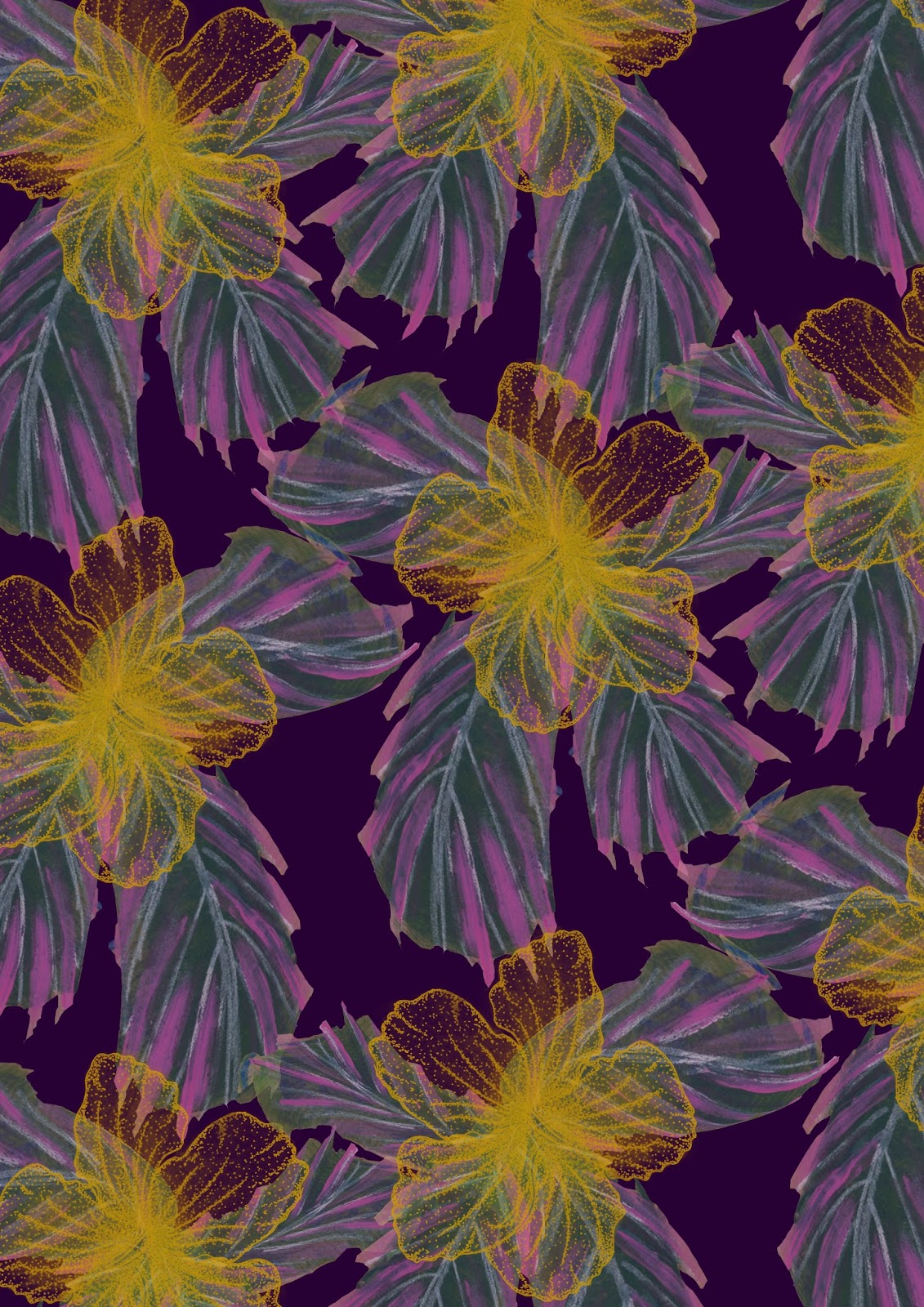
I have been working digitally to design prints for this project, i have mostly found myself working on tropical florals. this was spurred by the 'iridescent tropicals' trend for SS17 and inspired from my thai travels.


For this design i used he hibiscus drawings and also a few lea drawings from a previous project at college that i still had saved in a layer bank. 
i feel this print is effective because if fits the design requirements and would suit the market i am working towards. It fits the beachcomber trend for SS!& and the tropical trend also.

I have developed this design further into black and white. From that, i shall use the print to apply heat transfer dyes to, from there i use the print ton fabric. This technique will give the effect of digital printing, but with a more hand made feel and also is quick and easy to reproduce on a small scale.

Also this week, i printed my previous designs onto silk using digital printing. this is a new technique for me and i was quite excited to see the results. Once i hd collected my silk digital prints from the studio; inspired by the trend, i decided to add some foils to them to enhance the iridescence vibe. i found that this was really effective on the darker prints and also worked really well with the bronze foil. i will take this forward to my final designs and i feel they were very effective, fitted the design brief, theme and market. i decided to scrape the foiling glue on vertically as i have been working with this vertical image idea throughout my project, this was inspired by the long tiles of the grand palace.

Friday, 20 November 2015

Recent Designs

Here are a few print designs i have been working on using photoshop recently. i have been inspired by the tropical iridescence and beach trends within rends forecasts for spring/summer 2017.  feel this is fitting trend to work with considering my theme is my trip to Thailand. i still need to work on how i can include the overarching theme of future and past within my work, however i feel i can do this by using older textile techniques, like batik, Lino and screen printing combined with digital print brings together the past and future aspect of my work together and will create rich and interesting outcomes.


This design was the first of my designs fitting the tropical iridescence trend. i used my color palette of dark jewel purple and a mustard yellow. i feel this work quite well and looks quite sophisticated in comparison some of my other previous designs. i then began to play around with adjustment layers, changing the hues of selected colors as seen below, this print has a new colourway.


I feel this colourway is a lot more suited to my market (Topshop, Motel Rocks) because it is slightly more muted but also has hints of pink iridescence on the leaves, but also a glow from the dusty yellow hibiscus flower motif.

During a tutorial, it was suggested i use more texture in the background of my designs as, to be honest, they were slightly flat looking. To fix this i began making small samples using old dying techniques like shibori and tie dye. i then scanned this into the Macs and worked on top of these. i really like the result in comparison to not using a textured background.


I feel using the textured backgrounds really pulls together and adds depths to the design. in this deign i as playing around with the idea of mixing inspiration i got from an artist (under the alias @acommonname). I previously researched her urban geode work during summer (previous post on this blog) and felt i would like to experiment tight mixing hard futurist lines with soft petals of thai hibiscus. however I'm unsure this deign is really fitting of the market I'm working toward. i think this because it is perhaps a bit 'wacky'. perhaps it may work for a swimwear line however. I shall experiment with fashion illustrations and evaluate this in time.


This design was created using a water cooler painting, i then layered over the lotus flower motif in a geometric style - reflecting the urban geode vibe i have been looking at.