Tuesday, 17 May 2016

Unit X: James Long - Textiles Samples pt. 2 & Line Up

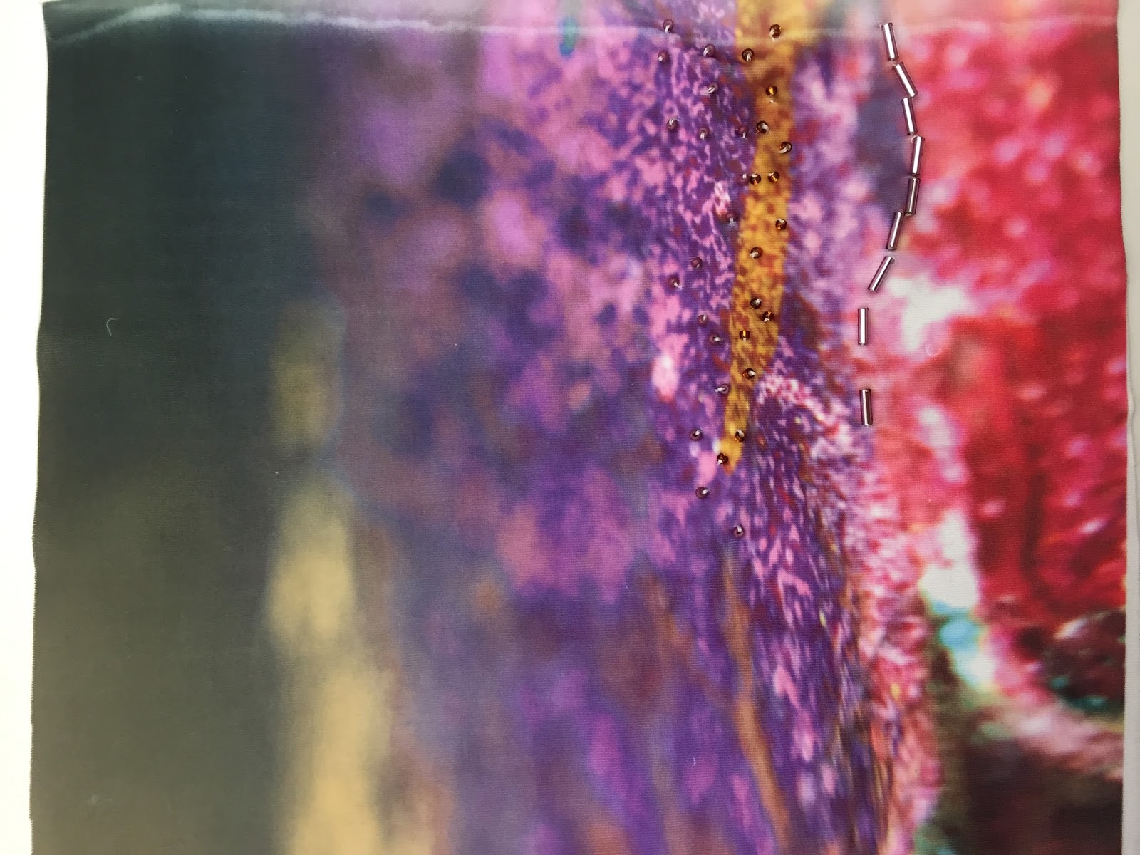
Just before our presentaion to Tom on May the 9th, i wanted to quickly contribute some more samples to the group, just so we had more than enough choice. i decided to experiemtn with the sublimation printer as it is something i hadnt worked with before and i am a keen digital print designer, so this is a quick and easy way to apply digital design onto fabric. I used two of the macro images i had taken during the beginning of the project and adjusted the colours and shades on photoshop to match the colour palette we are working with.


From these i used the heat press to apply them to a range of synthetic fabrics as you can see below. During one of our sessions, natalie suggested we started to use beading on our samples so i have worked into these with beading also and it gives quite a pretty outcome with lots of texture.


Above: Sublimation onto white foamy mesh.
Below: Sblimation onto textured fabric with appliqued mesh and beading - one of my favourite samples from the sublimation experiments.
Third below: Sublimation on white scuba with bead detail. i really like how clear and deatiled the subliamtions are printed onto the fabric and is deffinatley somehting id like to work more with in the future.  


I can see these samples being used on things such as tshirts, jackets and panels within these garments as well as all over. they would make interesting placement print ideas also. i feel these designs really emulate the rust and decay theme quite well because of their smokey deatils and scattered beading - everything is quite orgaincally placed much like rust and decay.

Unfortunatley, by the time i had completed these, i was a few hours too late for them to be used in the line up which we worked togther on after a session with Sarah and Natalie. We needed twelve looks so, together we placed all of out garment designs on a table and decided how many of each garment we needed and then picked which ones to chose from the selection. once again my designs were mainly overlooked bat a pair of shorts - and i am unsure as to why, however, we got the task completed and began to wok on the illustrations for the line up.


Unit X: James Long - Group File

For our presentation to Tom Norcombe from James Long, as a group have to create file explainign or design journey. it must include things like intial ideas and themes, muse reserach and development, initial garment designs, textiles ideas and samples and final line of twelve designs. i was finally recognised as the illustrator of the group after trail and error from the ither members of the group, thus my job was to draw any functional details we had researched, the sleeve and collar samples nicole had made from the textile designs and also the lines of the final line up. Which i was persoanlly thrilled with and finally felt trusted enough to have a responsibilty within the group. i finally felt like i could make a valuble contribution to the group as not a lot of my other work had been taken note of and i could tell one of the tutors may have picked up on this too when during a tutorial she asked why we (as a group) hadnt been using a few of my samples.

Below are my drawings along with Nicoles fantastic sleeve and collar samples. i am very impressed with the sleeves as they involve a lot of different techiniques. she used two cords of piping on some and two samples from the other girls work and also a ribbed cuff and they look great. 


Unit X: James Long - Range Building Workshop

Todays workshop was to help us to start beginning to think of how we can apply our samples to garment designs. I looked at my garment and fastenings research to see how i could use my research in designs. i looked at the idea of using cable knit as thin panels runnding down the arms of a jacket. I drew matching shorts to accompany the design and Sara suggested to me to continue developing the design by changing it slightly and adding more of the cable texture of the sweatshirt. i also extended the idea of the mesh panel from under the arms side to all the way to the centre fold. the shorts developed by getting shorter, and adding cable knit ribbed pockets. Below is a design development working from left to right.


 Above is a photo (upside down i know) of a few rough designs out group came up with during the workshop.

  
Above here is a photo of our designs further along during the workshop. Here we have began to add colour to them. My designs are to the left of the photo. I feel i began to create a good range of ideas and have tried to apply my samples to the ideas and few of the other girls samples to the designs.

Unit X: James Long - Trend Research

Although it may not always be needed, personally i prefer to have some trend research to back up my ideas and contextulaise my designs to current and future applications, thus making them usable and in demand. 

Using WGSN, i researched trend in textiles and fashion for men for spring/summer 2017 - the season we are designing for. I discovered that mesh is big trend an this can be seen in stores across manchester at the moment - luckily, as a group we cottoned onto this when looking at sportswear so already sourced mesh fabrics for use for our samples.

I also noticed a strong print design that had graohic shapes and bright colours, similar to the groups samples. it mentions of inspired by urban textures - as were we.

Uni X: James Long - Digital Design Experiments

From my drawings, had a little play on photoshop with some digital print designs from my drawings. this is made from the scratched foil in a nail shape, i then scanned it into photoshop and using a collection of adjustment layers, i created a brush pattern with the scribbley, scratchy nail shape. Below are the results.


Natalie suggested in our group tutorial that i get these onto fabric, however i couldnt afford to at the time pay for digital print, and with my previous troubles with crippling anxiety, i found my knowledge of the university facilities to be lacking. However there is nothing stopping me collaging with these over a james long catwalk picture to see how they would work on his silhouettes. i could develop that idea even further by collaging my designs over vintage tennis garment photographs to see how they would work on a garment like that.

With these designs ive tried to keep the masculinity within them and the James Long gritty vibe that a lot of his designs have. i have done this by keeping the colour pallete quite muted and a little on the dirty side.

The Scratchy nail shape would also work really well into machine embroidery as well as print. i could possibly looking into how i can print this onto fabric on a budget and work into it with stitch.

Unit X: James Long - Macro Images in Depth

Below are a few of my personal favourite macros images I took myself from around the northern quarter of manchester. I tried to look for interesting colour compostions, textures and shapes when taking them. They mainly consist of graffiti, rust and rotting woods.


The macros lens for the phone camera has a convexed shape to it, thus it has this feathered, blurred effect at the edge of the photographs which is quite an interesting property, making the eye focus on the middle of the photo for detail.

Unit X: James Long - Textile Samples

I have spent time in the print room over the past week or so to create some samples to contribute toward the groups designs and final line up. I worked with screen print, foils and puff binder to create texture as i felt that was something we were lacking. Natalie also suggested that we should begin beading into our designs as no other grouops had thought of this so it would give us an extra edge. i went to source beads and found some magenta, copper and black beads. You may notice that some of the colours were slightly off from the colour palette, however when i asked for a photo of the palette to remind me (as we arent allowed our bags in the print room) my group were unable to help so i was left guessing as to what specific shades we were using. i think i manahed quite well, however, i did use a green which looked slightly more yellow than how it printed. those samples however are in my sketchbook.

 Above i worked on the bobbled fabric and placed stripes across it - inspired by the stripes seen on the sweatbands and Fila shirts Bjorn wore. i applied this idea to both side of the fabric to see how either looked. to the right of this i am screen printing striped on the towlleing we sourced. i little communication problem arose here when i didnt realise that i could use the screen our grouo had decided to use for screen as i wasnt made aware of this, so unfortunately my designs dont  properly fit in with the collection, however im sure if i were to work around this and perhaps make more it could collaborate with the other design. 


 I also experiemtned with reverse applique in white fabrics. i wanted to emmulate the textures seen in the macro images in the rust, but also keep it clean white like the tennis garment research i had looked at. This is possibly my favourite sample and i think it would work really well on a sweatshirt, or as a panel on other heavier gements. i used around five or six fabrics for this so it is quite a thick sample - but mainly is made of mesh and breathable fabrics like towelling, chiffon and scuba so is still suitable for s spring/summer season. 

A few more successful prints i designed involve the stripe we have seen from the sweat bands Bjorn wears. It was also suggested by natalie during a tutorial to experiment with a stripe. 

I experimented first with using the bobbley fabric and printed a stripe over both sides of it to see how it looks on top of and on the reverse of the bobbles. i personally preferred the reverse sidebecause it didnt catch all if the binder and this created a negative space effect on some of the bobbles. i then expeirmented with using stripe on the towelling fabric. i really liked the mix of the texture of the printed bindr and the fluffy towel. i then foiled over this to ad a contrast in the shine and textures of the sample which i think worked quite well. 

the bobbled sample could work really well as a loose trouser or panel on shorts. i also think the towelling stripe sample could work quite well as smaller panels or functional deatilas such as cuffs. it could also be interesting used for piping.    


My next two interesting samples came from an idea of using pff binder on mesh to see what effect that would create. i then developed that idea further by putting a second fabric behind the mesh whilst screen printing -  this in turn would push the puff bindr through the mesh and onto the fabric behind. I am really pleased with the textures i created here. the first picture below is the reverse of the puff binded mesh. it gave the fabric a lot more structure as it was quite soft before hand. i feel this was quite an inovative idea and could be applied to a shoulder panel or collar of a jacket of polo shirt.

The second photo is of the fabric that was behind the mesh. it worked just how i imagined it too and only came through the gaps in the mesh. once i applied heat to the sample, the texture is imense and really intereresting. it was like i had created my own sort of mesh which natalie aggreed with during a tutorial we had.  


I had created  few more samples but these, i feel were my most successful not only are they inovative in how i have created them, but also i beleive they fit with James Longs style quite well (the reverse applique and puff binder especially). In light of this, my grouo didnt seem too interested at all in these during our next session. due to my anxiety i am also quite shy and tend not to show if im proud of the work i have done, so perhaps the doubt in myself didnt encourage their attention toward my samples.