Thursday, 17 December 2015

Evaluation

The 'Intentions' project began with the holiday brief - to draw our summer. I traveled Thailand in march so I took inspiration form my travels around the beautiful, tropical country.  I mostly began to look at drawing the decayed tiles of the Grand Palace and the fresh flowers i saw around the city of Bangkok. My theme future/past is reflected in a lot of my inspiration; ancient buildings with the new fresh flowers. The sources create a contrast.
I drew many motifs as I wasn't too sure what was meant be 'drawings', so when I attended the drawing workshop, I understood this also meant mark marking and creating texture. So from there continued to work on these textured drawings. I also took some more inspiration from the city of manchester by visiting China town and viewing the ornate arch.

I began to crate a few of my first few digital designs during a cite cloud workshop using the motif I have drawn previously. At the time I believed they were really incredible, however; compared to my facial designs, these ones are quite static and still.

I needed to contextualise my work before i continued making empty designs with no meaning. I researched trends for spring/summer 17 on WGSN. This is a very important resource to see future trends in fashion, textiles, interiors etc. I came across two interesting trends that suited my initial sources and my market demographic - tropical iridescence and beachcomber. The tropical iridescence trend is slightly dark colors with highlights of neons and vibrant colors. The visuals are of tropical foliage and flowers and is inspired by cuban art and imagery. The beachcomber trend is compiled of batik and hand dyed visuals and inspired by surf and sea. to interpret these trends I experimented with tie dye which I used in the background of my further prints and candle batik - however this was unsuccessful. 

After a tutorial it was suggested I started using more texture in the background of my digital designs. this will give a richer outcome to them so I experimented with tie dyes and shibori techniques. Then scanned them into the mac and worked onto them digitally. Doing this has reinforcedthe future/ast theme back into my work because tie dye and shire are older techniques which i have fixed with digital design - thus a contrast between future and past has been created. 

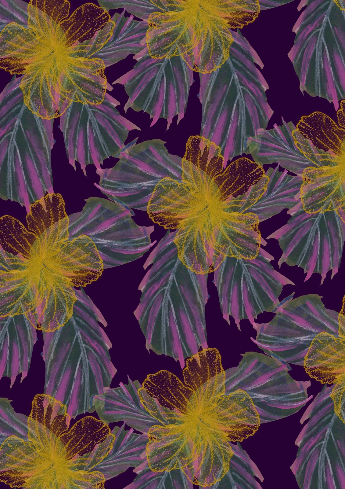
Continuing to develop my designs I decided to experiment with foils and flocking also which I believe was very successful and have used in my final deigns. I really liked how the gold and bronze foils made the topical prints even more so iridescent. This technique also made them a lot more marketable looking and suited o my market of shops like Motel Rocks, Zara and Topshop. Initially i printed a few of my samples onto silk, however given the market i am  designed for silk may be a bit too pricey so would suggest they would be printed on something similar like a georgette rayon -  light fabric that is synthetic and more economic than silk - it is also vegan friendly.

During my Project i found myself struggling with insomnia and anxiety and because if this I missed a lot of studio time. Unfortunately I did not get to physically print anything via screen due to my sleeping pattern, if i were to have the opportunity to redo this project i would hopefully been able to screen print as i do enjoy it. I also would have enjoyed using techniques such a procion and manutex printing. I would also crate a time line to complete weekly tasks to keep on top of my workload. this may also be very motivating when the tasks are complete each week.

I have six final outcomes which i am quite pleased with and are all digitally designed (due to the previously mentioned) i feel they could be sold for fashion to the markets and brands i was working towards because they are on trend for ss17, are young and fresh looking designs and are very summery visuals. Designing digitally and using photoshop want  new technique to me, however using more texture in my backgrounds for my designs was and i feel it was a good leap into the right direction for my future designs. I also had never digitally printed onto fabric so that was a new and exciting technique for me to look at and continue to work with in future.

Tuesday, 15 December 2015

Current Print Designs

I have been working digitally to design prints for this project, i have mostly found myself working on tropical florals. this was spurred by the 'iridescent tropicals' trend for SS17 and inspired from my thai travels.


For this design i used he hibiscus drawings and also a few lea drawings from a previous project at college that i still had saved in a layer bank. 
i feel this print is effective because if fits the design requirements and would suit the market i am working towards. It fits the beachcomber trend for SS!& and the tropical trend also.

I have developed this design further into black and white. From that, i shall use the print to apply heat transfer dyes to, from there i use the print ton fabric. This technique will give the effect of digital printing, but with a more hand made feel and also is quick and easy to reproduce on a small scale.

Also this week, i printed my previous designs onto silk using digital printing. this is a new technique for me and i was quite excited to see the results. Once i hd collected my silk digital prints from the studio; inspired by the trend, i decided to add some foils to them to enhance the iridescence vibe. i found that this was really effective on the darker prints and also worked really well with the bronze foil. i will take this forward to my final designs and i feel they were very effective, fitted the design brief, theme and market. i decided to scrape the foiling glue on vertically as i have been working with this vertical image idea throughout my project, this was inspired by the long tiles of the grand palace.

Friday, 20 November 2015

Recent Designs

Here are a few print designs i have been working on using photoshop recently. i have been inspired by the tropical iridescence and beach trends within rends forecasts for spring/summer 2017.  feel this is fitting trend to work with considering my theme is my trip to Thailand. i still need to work on how i can include the overarching theme of future and past within my work, however i feel i can do this by using older textile techniques, like batik, Lino and screen printing combined with digital print brings together the past and future aspect of my work together and will create rich and interesting outcomes.


This design was the first of my designs fitting the tropical iridescence trend. i used my color palette of dark jewel purple and a mustard yellow. i feel this work quite well and looks quite sophisticated in comparison some of my other previous designs. i then began to play around with adjustment layers, changing the hues of selected colors as seen below, this print has a new colourway.


I feel this colourway is a lot more suited to my market (Topshop, Motel Rocks) because it is slightly more muted but also has hints of pink iridescence on the leaves, but also a glow from the dusty yellow hibiscus flower motif.

During a tutorial, it was suggested i use more texture in the background of my designs as, to be honest, they were slightly flat looking. To fix this i began making small samples using old dying techniques like shibori and tie dye. i then scanned this into the Macs and worked on top of these. i really like the result in comparison to not using a textured background.


I feel using the textured backgrounds really pulls together and adds depths to the design. in this deign i as playing around with the idea of mixing inspiration i got from an artist (under the alias @acommonname). I previously researched her urban geode work during summer (previous post on this blog) and felt i would like to experiment tight mixing hard futurist lines with soft petals of thai hibiscus. however I'm unsure this deign is really fitting of the market I'm working toward. i think this because it is perhaps a bit 'wacky'. perhaps it may work for a swimwear line however. I shall experiment with fashion illustrations and evaluate this in time.


This design was created using a water cooler painting, i then layered over the lotus flower motif in a geometric style - reflecting the urban geode vibe i have been looking at.

Monday, 19 October 2015

Brief

Future/Past
Source material for this project will consist of photographs I took of temples and the decaying walls of such during my visit to Thailand in march of this year. I also took much inspiration from the street art around Bangkok and the other urban areas of Thailand. This interest in street art and graffiti can also be carried on within Manchester as the city is adorned with street art. Within the Thailand inspiration I am mainly looking at the decay of the buildings; peeling paint and crumbling concrete. I also love finding new growth within these decayed and decrepit walls - much like the work of Paige Smith who I mentioned on an earlier blog post. I admire the idea of nature taking back over man-made things but also what is beneath the peel and decay. The rich colours of the temples also appeal to me and will be strong influence in my colour palette. I will look at more current street art and mix that source with the ancient Thai walls and this will represent the future/past theme I have chosen. i will also look into using traditional techniques like screen and lino print (represtning the past) and mix that up with layered over digital prints thus representing the future. I shall also experiment with using flocking for texture, foiling - similar to the golden foils covering the temple walls - and heat transfer dyes to create rich outcomes.

I shall develop my visual research by experimenting with collaging my drawings into more developed drawings but also fashion illustrations to see how the print design could work on the body and on garments. To do this I will need to to thorough trend research into the season and market I am designing for. To help me develop my designs I will have feedback from group tutorials and will analyse my ideas and designs against my target market.

I'll be designing for womens fashion for the Spring/Summer 16 season. I am focusing on the look peeling and decay which could possibly create a very abstract outcome that is dark in colour but rich in visual appeal and also possibly look into using appliqué or stitch to give texture. 
The market I would be designing for would be mid range high street that is trend aware and the demographic of females aged between 21 - 26. a majority of these will have graduated and earning around eighteen thousand pounds a year, possibly still living at home and are very fashion focused. To display this properly I shall create a sort of client board to achieve a visual for the kind of demographic I am designing for. The shops I will research for this are places like Topshop, Zara, Mango and Monsoon.

Drawings

Looking at the shapes I saw within the decorative walls of the temples in Thailand, I decided to use these shapes further in my drawings. I used a lot of diamond shapes within these two drawings because I like the contrast between the disparate lines of the diamond shapes with the rough organic marks of the gouache.
I have also introduced colour into these and have used a mixture of the current pinky and blue I use to create a purple shade, and also a rich yellow to represent the gold of the temple walls. What I didn't realise at the time about this colour combination is that whilst in Thailand, I would see bunting and flags of these colours.


I also introduced stitch into this drawing which I think this was a successful idea and may explore the idea using stitch within my samples.


Saturday, 17 October 2015

Group Tutorial 12/10/15

During my group tutorial this week it was discussed that I should start drawing bigger drawings. As I am designing for fashion, my drawings should be as big as the garments i am designing for. this will also give me bigger experimental range on my mark making resulting my more creative outcomes. 
My drawings have a 3D aspect in the way that I use ripped pieces of paper to add more texture to the drawing. The fact I am also focusing on peeling and decay also naturally gives a more £D effect to my work and so it was suggested that I look into using appliqué with in my designs. But that also brings up the implication of how expensive that would be to produce in comparison to my market I am working towards. So that is also something i shall need to consider further. How will the cost of my process effect the potential cost of the final design and also how will that effect my chosen market.
To develop my drawings further i would like to photocopy them (and perhaps use that copier to manipulate the colours too) and create fashion illustrations and collages from these, just see how these early drawings could also work as prints and give me an idea of what kind of garment my designs could work on.
A mood board for colour should be created by next week. this doesn't have to be final colours but just loosely looking into what colours interest me. and also think about colour distribution. how much colour ratio and where abouts will it be in my designs?
I also need to look at current trends for fashion, so a trip into town to look at the clothes out there will give me a good idea of this. i will also use the internet to look at current trends and even lookbooks within shops.

Saturday, 10 October 2015

'The event of thread' lecture and some personal reflection

Textile artist Hannah Leighton-Boyce held a lecture for her work 'The event of thread'. the piece is somewhat of a live sculpture, where using woollen yarn she had spun herself, she and the village of Helmshore, weaved 3300 yards of yarn through houses and over gardens tracing the lines of which the old mills tenter fields lay. during her research fir this installation she came across some information that mentioned when the mill worked would carry the tentered fabric through the village and some would say it resembled a Chinese dragon parading through the village. I felt this oriental comparison also related to my theme of work currently as I am looking at Thai and oriental sources.

However, on this note I also feel that I perhaps and running out sources and inspiration for this oriental theme and that my drawings are either all too similar or very very different in theme (i.e boats and walls of temples), so on this reflection I feel my sources developing from the old walls into using the word 'peel' and 'decay'. I also feel this development relates to my over ruling theme of future and past.

Looking further into Hannah Leighton-Boyce's earlier works I came across and interesting piece called 'composition - movimentum'. 


The piece was created in 2010 and When Leighton-Boyce travelled through London, Berlin and Stroud on foot, by bus and train. She was exploring the relationship between mark making and marking time. I find this interesting because there are many types of mark made here and the fact that it was achieved just through motion of walking, like the tremors of footsteps or a pothole in the road marking the paper is quite fascinating. Reflecting on this idea, I feel i should be a little more free with my drawings and less controlled. This would look fantastic having been machine stitched onto fabric also.

Tuesday, 6 October 2015

Drawing Workshop

As previously mentioned, I attended a drawing workshop. At the time I couldn't add photos but from now I can. 
I really wanted to focus on the peeling paint from the photo I had taken at the grand palace in Thailand. i took the essence of the photo and focused on the textures i could see within the peeling and decay.

To create this drawing I scrunched up paper and used ink to stamp the background in. I then used masking tape to create layers. I then used the same stamping technique over this. Finally, I rolled and peeled back half of each strip of masking tape and then used water colour on the softer ripped edges so that it would run through the tape. 


I also worked and a selection of 4 smaller mark making drawings inspired buy the same photo. this time I focussed more on the the shapes I saw in the photo this time as opposed to the textures.

The top two are similar in technique. I used masking tape and water colour to create texture and also rugged lines and shapes. I really like how the water colour bleeds into the masking tape. I also used fabric dye and bleach to create the pink and blue colours and also it creates an interesting transparency to the drawing. 

The third drawing wasn't as successful as the others but I could improve it. The fourth drawing was successful because I feel it reflects the 'hidden' vibe I am looking at within the peeled area. i created this by pushing graphite off of a shaped piece of card, then hiding parts of the drawing using mashing tape. i then used fabric dye to paint over that with and then applied bleach other that, resulting in yellow peach tones. I then removed the masking tape and exposed the graphite beneath. 


I could develop this further by using acetate to layer up my drawings.

Anther drawing using bleach, but this time I used the word 'scratched' to inspire the drawing. for this i also layered magic tape shapes similar to that i have seen on Thai temples. it has created quite an organic image but has subtle squares and lines within it.


Wednesday, 30 September 2015

Inspiration Workshop

I attended an Inspirations workshop on the 24th September with my group to help get a grasp of what I may need to do next within my drawings and have to have more ideas to work on.

My feedback consisted of: 
Trying out some more mark making and making those more abstract but also to not refine them within motifs.
Using mixed media to create rich and textured drawings.
work towards a colour scheme and perhaps narrow down my sources so that there is a correlation between drawings.
To have a look a WGSI online for upcoming trends. this will help me set a demographic for my designs.
Experiment with bleach and fabric dyes on paper.
Visit china town for more local oriental inspiration.

That afternoon I did take a trip to china town to look at the detail on the arch, (the photos I took however are on my phone which is currently being fixed, however, I shall work from them once I have it back)

I have also narrowed down my sources and am focusing on decorative Thai walls - ones seen at the Grand Palace.

On the 28th September i also attended a drawing workshop where we were asked to create 6 drawings. I chose to use: collaged, textured, scratched, overlaid, random and printed. I also took words from my sources and looked a peeling textures for my mark making.

i have also looked at using more mixed media in my drawings including using masking tapes, bleach and dyes, inks and a range of pens. Photos if these drawings shall follow in a fore coming post.

Wednesday, 16 September 2015

Summer: Turkey

During my summer I also visited Turkey. Equipped with my underwater camera I spent a lot of my time snorkelling. The underwater world is so interesting to me, as once again, it is something people don't take too much notice in or see every day.

Corals and underwater plants hold so much texture and could be used for textile design inspiration for embroidery, weaving, fabric manipulation and print designs. 

I could possibly explore the idea of weaving inspired by coral and then creating prints from the physical weave itself. This would give an abstract and didactic feel to the outcome.


I can only imagine that this is my reflection reflection back off of the surface of the water, but I appreciate how the water movement itself breaks up the reflection. It may be an idea to investigate pleating fabric before adding print to them (whether that be via screen print or heat transfer ect) or using Photoshop to manipulate designs to achieve this effect.


The corals and plant life surrounding the cold springs I was swimming near were shades of lilac and warm orangey browns. There was also some interesting shell or growth formations on some of the rocks which caught my eye as seen below.


I find it fascinating how water reflects light, I admire the patterns it creates from the surface and also when said light hits the base of pool/seabed. I could possibly experiment with marbling onto fabric and layering other techniques like batik over that.


Thursday, 10 September 2015

Summer: Thai Islands

Whilst I travelled Thailand, I visited three islands; Koh Samui, Koh Tao and Koh Phangan. a lot of my activities on these islands involved water and the sea. I collected a lot of shells which you may find drawings and sketches of in my sketchbook. I also collected a lot of photos of sunsets - a habit I also took back home with me.


What I find really interesting in sunsets and sun rises is that everyday its going to be unique, the sky will never look exactly the same again and I find that fascinating. Above is a photo I took in Koh Phangan. The silhouettes of the palms against the pastel blue and peach sky is very pretty and could easily be translated into designs for textiles.


Another inspiration I found was in the sand. a lot of the beaches had washed up corals of which their textures and structure could be translated into print designs alone. they hold tiny details which could be expanded into large prints or layered on top of each other with other designs.


Paige Smith: Urban Geode

Instagram is a great mobile app where you can stumble across new, up and coming artists and designers. Whilst I was scrolling through the app I discovered this artist, Paige Smith, under the alias of @acommonname.

She creates street art installations in unusual and forgotten places on street corners and in dishevelled brick walls.


Her work mostly consists of crystal, geode like formations that appear to be growing from urban spaces.

I find it interesting due to its similarity to the idea of nature taking back what once was and that maybe man can only leave a small footprint against mother natures force.


I particularity like this image due to the composition of the organic shapes or the plant, the softer shapes of the rock wall and also the rigid angular lines of the geode.

Her choice of location for her work also intrigues me. I have had an interest in the life that is within decay for years and i appreciated this a lot whilst I was travelling. the streets would have cracked and crumbling walls still would have fresh orchids sprouting through the crevasses.


Her work is small and may also go unnoticed by those who don't necessarily look at their surroundings, which I find a lot of people don't do this any more.


Wednesday, 26 August 2015

Summer: Chiang Mai

From Bangkok, I then travelled north to the rural area of Chinag Mai.
Here, I met a group of elephants and learnt how to talk to them in Thai and also had the opportunity to ride, bathe and explore the jungle with these majestic creatures.


this elephant was named Papa Jo. I think he had the most interesting skin markings on his trunk. these could easily be translated into artwork for potential print designs.


After the elephant experience,  myself and the group had a hill trek scheduled so began our 4 hour trek top our hut accommodation for that next night. I chose this photo because i like how the plants and flora create silhouettes against the clear sky.


I visited Thailand during the drier season, so theses rice paddy fields were out of use, however they create such an impressive mark on the landscape. they sort of remind me of contour lines on a map.


I visited a waterfall on the climb to our accommodation and this was our last chance to shower. I really love how the foliage is layered creating shade over the cool water.

Tuesday, 18 August 2015

Summer: Bangkok


My summer began on the 11th of March. That day I stepped on the plane to travel Thailand, alone, for one month. First stop, Bangkok.


I visited the Grand Palace which shimmered with gold foiled, mosaic tiling. I was in complete awe at these buildings, their detailed decoration was breath taking.


Here is close up some of the more decrepit and decayed, but still beautiful detail of the buildings from the temples. Decay is something I find very inspiring to look at; the textures are very interesting to work from.


The Grand palace was very beautifully adorned with orchids hanging from the exotic tree in coconut shells. flora is a very popular textile print design subject and Thailand had many flowers that i have seen first hand and have primary photos of for future drawings.


Later that day I travelled back to Kaoh San Road and explored around there. Street art and graffiti is something i find very interesting as it lights up cities with individuality. the alley ways around Kaoh San Road and my hostel were covered in street art and stickers. I feel it gives a city personality.