Here are a few print designs i have been working on using photoshop recently. i have been inspired by the tropical iridescence and beach trends within rends forecasts for spring/summer 2017. feel this is fitting trend to work with considering my theme is my trip to Thailand. i still need to work on how i can include the overarching theme of future and past within my work, however i feel i can do this by using older textile techniques, like batik, Lino and screen printing combined with digital print brings together the past and future aspect of my work together and will create rich and interesting outcomes.
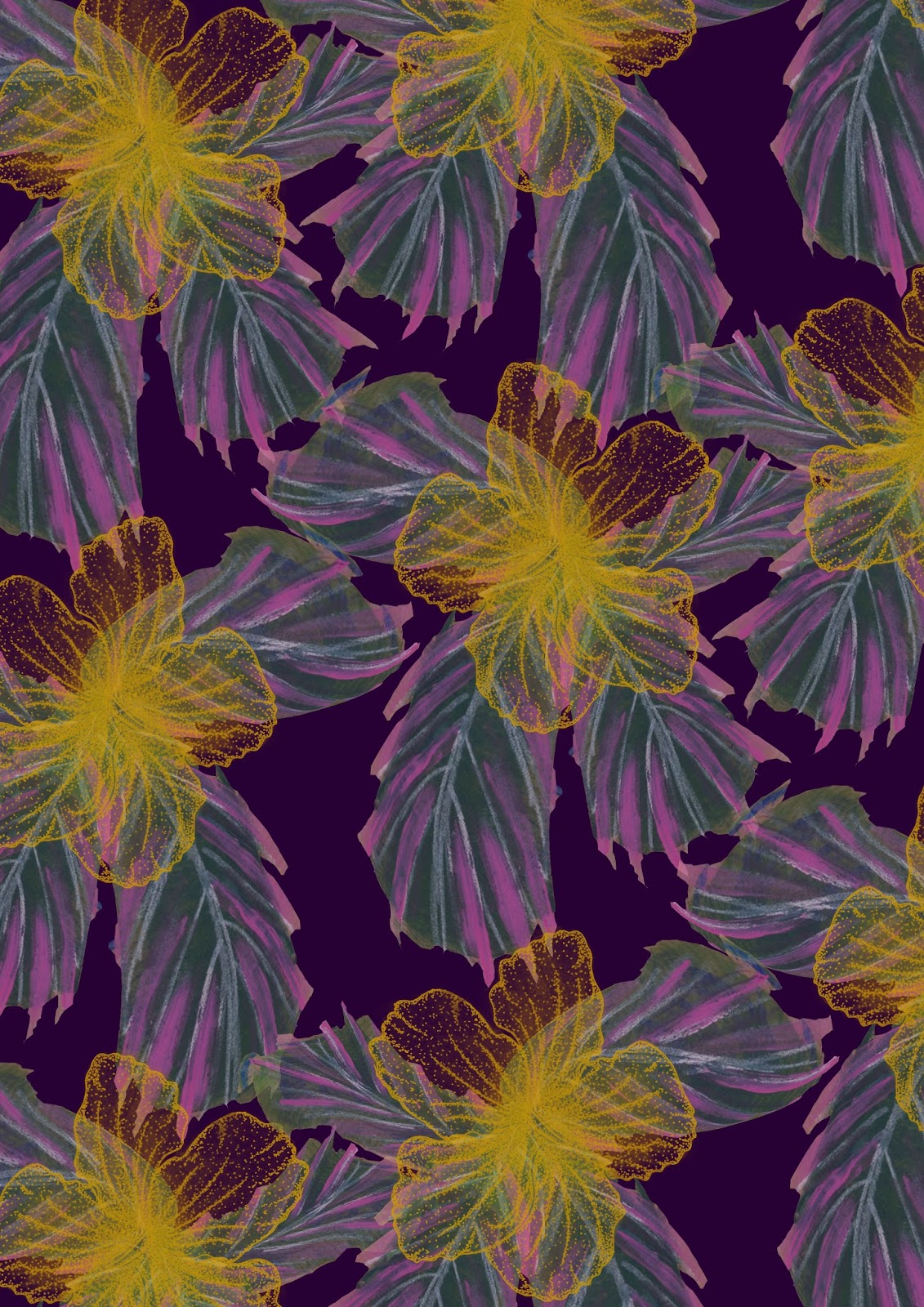
This design was the first of my designs fitting the tropical iridescence trend. i used my color palette of dark jewel purple and a mustard yellow. i feel this work quite well and looks quite sophisticated in comparison some of my other previous designs. i then began to play around with adjustment layers, changing the hues of selected colors as seen below, this print has a new colourway.

I feel this colourway is a lot more suited to my market (Topshop, Motel Rocks) because it is slightly more muted but also has hints of pink iridescence on the leaves, but also a glow from the dusty yellow hibiscus flower motif.
During a tutorial, it was suggested i use more texture in the background of my designs as, to be honest, they were slightly flat looking. To fix this i began making small samples using old dying techniques like shibori and tie dye. i then scanned this into the Macs and worked on top of these. i really like the result in comparison to not using a textured background.

I feel using the textured backgrounds really pulls together and adds depths to the design. in this deign i as playing around with the idea of mixing inspiration i got from an artist (under the alias @acommonname). I previously researched her urban geode work during summer (previous post on this blog) and felt i would like to experiment tight mixing hard futurist lines with soft petals of thai hibiscus. however I'm unsure this deign is really fitting of the market I'm working toward. i think this because it is perhaps a bit 'wacky'. perhaps it may work for a swimwear line however. I shall experiment with fashion illustrations and evaluate this in time.

This design was created using a water cooler painting, i then layered over the lotus flower motif in a geometric style - reflecting the urban geode vibe i have been looking at.
No comments:
Post a Comment